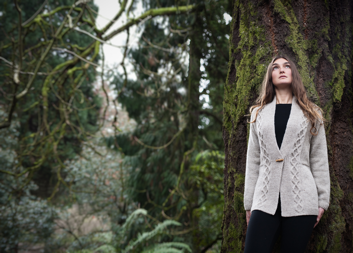
because it would be absolutely INSANE
to talk about AUTUMN now that it’s broiling
here in the Midwest I decided not to…
NOT!
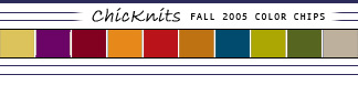
Above you see what the ColorPicken industry people project as the Fall Colors for the coming season:
from left to right:
– Rattan
– Gloxinia
– Ruby Wine
– Burnt Orange
– American Beauty
– Glazed Ginger
– Morrocan Blue
– Moss
– Burnt Olive
– Atmosphere
Now, personally, I think I could eliminate about 20% of the colors out of this group as being not my *season* (teeheehee…) (Maybe I should just give Ginger a try?) BUT the other 80% hold some real promise! What do I especially SPY in there? Something they’ve called *MOSS* which of course is just another variation of my very own favorite, KIWI, b.Lime, Chartruese, etc, etc, etc. I’M THERE! So empowering to know one can still be in fashion even while possessing a dyed-in-the-wool obsession…
Speaking of someone who is not only in fashion but appears to be ahead of the curve, I found this color card while looking for DK weight yarns – pretty much covers most of it, non? (These colors were offered this spring.) Also, anybody know where the yarn classifications come from? I see reading the yarn info it’s listed as “classic” and “precious”.
Well, I guess I’ll be in style for once in my life, since I just started a Ribby cardi in “moss” and “Moroccan blue”! Who knew I was capable of anticipating what the industry color people would choose? It’s a first, for sure.
Gloxinia?! I like the color, but that’s one WHACK name!
I am loving the sumptuous fall colors, esp the trio of Morrocan Blue-Moss-Burnt Olive. (That’s what olives look like burned?)
Looks like I’m doomed this year. I’ll be in purple and not much else. When I’m an old woman is already here! GAH!
ze Gloxinia! If I remember correctly, that’s a flower and it’s in the same plant family as the African Violet?
Hey, I’ve got some hand dyed Morrocan Blue that’s been aging in the stash. Thanks for clueing me in. But why oh why Bonne Marie are you encouraging me to surf the net for MORE YARN? BTW, I think the unofficial definition of “classic” yarn is “non-Muppet barf” and “precious” is the stuff we’ll pay up for, like cashmere and silk.
I loved getting these when I worked in fashion. I hoarded color chips like precious items. Even now, I am married to my Color Beautiful Palette and never stray from “my colors”. All the better when the designer palettes match mine!
I love these colors…It is great to see some user friendly colors in the Autumn lines
Gloxinia sounds like a medication a dermotologist would prescribe. And HEY! I’m all for the Ruby Wine…love that color.
Ah, yes, the American Gloxinia and Gesneriad Society (top result when you google “gloxinia”)has set me straight. And they *just* had their convention, too! Two of the plants in the family are called the Lipstick Plant (Aeschynanthus), and the Goldfish Plant (Nematanthus)! Fun with Gloxinia!
Mmmmm. Those colors are scrumptious. Is it illegal to get an early start, or do you have to wait until equinox?
Just an observation- these look like the colors you see in all the Mission Falls ads. Were the color selections leaked? Is this a republican conspiracy?
Atmosphere??
Hmmm – Me thinks I’m getting old, cuz I’m sorta “settling” in to my colors – they are pretty much the same, regardless of season [except that I tend not to wear drab olive green in the spring & summer]. I guess I just am starting to know what I look good in. So I can almost ignore the color “authorities” lol. :)
Mmmmm. Burnt Orange. Glazed Ginger. Moss, we can do together. Yeah baby!
Uh oh… As someone who likes her colours cool and bright, I’m not seeing much of this new palette in my future wardrobe.
Time to jump in the stash!
I’m with Claudia…go Burnt Orange and Glazed whatchmacallit! I’ve got something lovely on the needles in Koigu that is one of the lovelies in that colour pallate!
I think that the terms Classic and Precious might come from a series of Japanese color books that were all the rage a few years ago in graphic design circles. The books featured swatches of colors arranged under various headings meant to evoke moods. Classic might have navys, while Serene mightl have powder blue and Precious might have jewel tones. Search Under Designer Color on Amazon and see the TOC for Designer Color 5. It will give you a good idea of the various categories.