Even though I’ve lived here for over 8 years, there’s still parts of the neighborhood to discover!
All it takes is a simple 15 degree shift of focus, turn left, go north.
So far, while making some keys, I found some decent Chinese take-out I’d never noticed before.
And bonus of Bonuses, a Benjamin Moore Paint Store, right around the corner a couple of blocks away.
Let the Chips Fall Where They May!
I scooped up about every taupey brown combo I could lay my hands on and put them all out in a row to study.
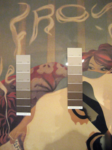
The plan is to try and match a tone in the picture you see above, a favorite, hanging in mon boudoir…
It is a print from the cover of an Art Nouveau Magazine called Le Frou Frou, that was popular in Paris in the early 20th Century. I love the red-haired Can-Can dancer taking a break from her hectic shift. This one was by Lucien-Henri Weiluc.
“Lucien-Henri Weil, assumed the Nom de Plume of Weiluc was first published in La Caricature. Early in his career he briefly signed as Luc Weil, but the Weiluc name stuck and went on to appear in various Belle Epoque publications including Gil Blas, Le Rire, Le Sourire, etc.
Weiluc’s work was shown regularly at the Salon des Humoristes. He would also take the reigns for the event in ther years 1907-1909 serving as coordinator and spokesperson. A few years later in 1911 he would become the head of the Societe des Dessinateurs Humoristes acting in the capacity of Director of the group.”
Now, I’m drawn to the tones on the left, something called “Griege Ave” #991 but I think the one on the right matches best, “Shabby Chic” #1018.
The plan is to do all the walls and ceiling in the taupe color then match some drapes to the burgundy…


I think that for the best result your walls should be the color you want, then one click lighter. You don’t want the painting to “disappear” against the walls, just to look like it belongs in the room.
Great inspiration piece!
I like the walls in the left chip so the painting pops just a bit instead of blending in completely. You could put the Shabby Chic on the ceiling and the Griege Ave on the walls, then you don’t have to pick just one of them.
I find the ‘Shabby Chic’ colours warmer than the greys…so if your bedroom is north-facing, you might want to consider warmer colours. I presume you’re going to use a wee touch of red to accent the decor? (i.e., cushions, a lampshade…)
I agree with everyone above, the one on the right is a better match, but if you like the one on the left better go with it. And either colore will look great with red accents
It’s a matter of “your choice” here. Whichever makes you most comfortable and “right”. Sometimes you have to go with what you like and want and not what might be absolutely perfect for the poster. I love the idea of burgundy drapes, though.
I had a recent discovery. I found out that most paint stores (I used Epco) have computers now that can read a color and match it from just about any piece that you bring in, such as fabric, a pictue, even a tiny paint peeling (which is what I had.) Maybe you could bring your picture in and they’ll match the color for you.
I hope insurance is paying for the disruption at the CK altelier. Bet the new look will inspire new togs. Good luck!
Bonne, I think the one on the right matches better, but it looks a little beige to me… so I think I would go with the ones on the left. I’m personally more a fan of taupe than of beige…. Beige can get really old looking really fast. If you look at the green greys by the red hair of the dancer, you will see a nice contrast…..
Just my ever so humble opinion…. As a professional color eye matcher for a paint store (years ago, before they had the afore mentioned computers, I did the color matching)
And remember, it does not have to match, it has to complement the inspiration….
with that being said, have at it and have fun… I picked paint for my kitchen to complement my granite… woe is me, it matches the grey of the dry wall, who knew you could get paint the color of dry wall. So you may not want my advice after all….
L
If I wasn’t such a chicken, I would paint the ceiling burgundy… ;p
But how about one shade lighter or darker. I think my ceilings are 10′.
nummm, delicious palette. Excellent colors. As soon as I get the over-size, poorly placed porch roof (sun blocker) removed I’ll probably pick up a lot of the same colors. Please be sure to share all along the way!
What fun !! What yumminess………
And the best part is it is all YOUR choice !!
ALL looks fantastic !
*someone once said to put some vanilla in w/ the paint to eliminate
some of the odor…..haven’t tried it yet…..might be worth it….
JUST HAVE FUN !!
What about taupey stripes like in the background of the picture….
gorgeous belle epoque-y ness!
Any of the colors on the sample on the right would look nice, they have a nicer warmer tone.
WOW! I wish I could figure out how to do those stripes; wall paper anyone??