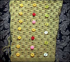
buttons, little Spring buttons…
Now that I’m done with one sleeve and over half of the first front of my Martha cardi, I can amuse and slack myself by once again pulling out the BUTTON BOX!
I love the multi-colored trims I’ve been seeing on many garments and am ready to take the plunge into extreme closure…
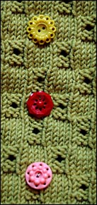
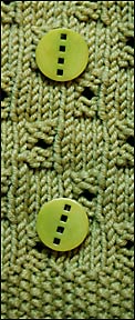
On the left you see the temptation: three different, brightly colored, vintage, (probably post WWII ?) novelty buttons. On the right, very modern, graphic 2k5 plastic buttons.
The design of the cardigan can flip either way – it is neotrad with a nice simple edge finish. I REALLY like those wild colored disks! I’ve had them for a long time and never really put them side-by-side but their diameters match (check), their saturations match (check) and they have a FOLLY all about themselves that make the sweater SMILE (check)! WHIMSY galore…
BUT the question remains – will I hate myself in the morning IF I freak out with all that COLOR!?
Those buttons are beautiful (and so is the sweater) but I think the “folly” would really come through louder on a simpler backround. I would go with the modern buttons for this one.
Beautiful green!
Live a little! You can always take them off and put on the modern buttons if it doesn’t work for you.
Go for it! They’re buttons! If you don’t love them you can always take them off!
I say try it, you’ll like it! And if you don’t, you can switch to the greenies at a later date. (Echoing a prior comment that I did not read first!) BTW I love that they are just a bit different in their designs . . .
I say go for it. You can always change them as your mood changes. Just think how cute the sweater will look with the colors AND it can go with ANYTHING!
the colorful buttons make that cardi SING! go for the color, chica.
all the best,
caroline
Go for the color! Wear it a few times, change them if you don’t like them, change ’em to something else some other time…
I say go with the multi-coloured buttons! It reminds me of Mary Englebreit designs. Has that 1940-ish look with lots of fun & kitsch but it does warm the heart. Hope I didn’t ruin it for you now since I have no idea if you even like Englebreit. I’m just an old sap for fairy-tale images and remembering Grandma MiMi’s house on the weekends with her baking and me delving into her 1920 encyclopedias. Now why don’t they make encyclopedias like that any more? I learned more in those old books and I can’t believe how dull and static current ones are.
Happy weekend!!
Go for the green. Love the shape and the color.
I say take a risk. You can easily change them later if you don’t like it…
I am also knitting Martha, crazy that I am, at the original gauge in the shocking pink of the picture. Bright pink is for me, what lime green is for you! I had pretty much decided to use matching buttons rather than the multi colored, until I saw your post today. Now I just can’t decide. They are both good, but in different ways. If whimsical isn’t your thing,(I too am a Mary Engelbreit fan)then I would go with the solid.
I prefer the older ones. the new ones are to hard/strong for the texture and the color of the cardi as i see it on my monitor. And as everyone says, you can always change buttons on a whim. Can’t wait to see the finished product.
I think the red buttons make the neatest, most modern (although also retro) contrast. It’s a beautiful cardi, though, whichever buttons you choose!
You can always change to the thoroughly mod buttons if you do freak out. Go for the color…it’s spring time (well, almost).
Go for the color! I agree, you can change them to the green if you get sick of the multi. Those green buttons are great all on their own.
Go for what you WANT! Go for the color. If the mood changes in a season, you can swap them out for more comtemporary closures. That is the great thing about buttons you know–you can match the season! :)
I vote mult-color….!
I think the red REALLY pop… but the pink is nice, too! Something about the new buttons strikes me as just slightly off… maybe they’re too big? But I know you’ll come up with a beauty either way.
I like the small ones better! But I think all 3 colors might be too “busy.” Covering up the colors one at a time on my monitor, I REALLY like the yellow and red button combo best. The yellow grounds the buttons to the sweater, but the red shouts “Look at me! I’m fabulous!”
I’m definitely in the multicolor camp. I love the way the red, yellow and pink work todgether and with the green — it’s like they are all meant to be together!
I love how the green buttons look against the sweater. Actually, I think that the buttons look more retro than modern, sort of 1920s/30s Frank Lloyd Wright-ish. But you are right–there is no whimsy or folly about those serious green squares.
Go with the colored buttons. If you don’t like them, you can always change them to the green ones. Sewing on different buttons isn’t a big deal.
I like the vintage yellow-green and red buttons, without the pink in the mix. I’d put those fabulous mod green buttons on something where they will pop more.
go the multi-coloured buttons!
I’d have to go with trinamac on this one–love the old buttons but you’ve got color on color AND pattern on pattern…
Color. If you hate it, cut them off.
What ever you try, put them on with “button pins” and wear around for a few days!
Of the buttons you have shown, I like the column of all yellow/green [can’t quite tell on my monitor] flowered ones the best.
A nice tortiseshell-looking button might be nice, also.
Well, I like contrast but in this case I really liked the shape and texture contrast with the green buttons. The retro ones’ bumpiness is just a little close to the texture on the sweater. Plus I agree with the comment that the green buttons look Frank Lloyd Wrightish. They have their own retro look.
Anything you do is going to be cute though. It is all fun.
I think I’d by-pass the dilemma and put some big fat gold buttons on this gorgeous green number!
Love the red ones.
Sorry, Bonne Marie, I can’t see any of these buttons working.
I can see a set of copper-colored half domes in a petite size.
Not sure why that is, but I think copper is coming back. At least I hope so or these highlights I had done this morning weren’t worth the tip.
I love the multi mix, but not on the green sweater. For me the textured sweater calls for the smooth buttons. Now you have to knit the perfect sweater for the vintage group…they really are great.
Wow! Incredibly, I didn’t even consider the texture on texture effect that was going on here. LOVE IS BLIND!
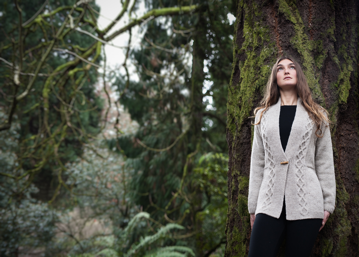
Good point! Have you seen the original sample from Rowan #37 (http://www.englishyarns.co.uk/images/rowan/feb2005/RowanMagazine37/BUZZ_L.jpg) Now – they show 3 different color buttons – smooth buttons…
I think the thing that got me going on the color was this one: http://www.englishyarns.co.uk/images/rowan/feb2005/RowanMagazine37/CHICAGO_L.jpg
where they show the multi-colored flowers all over the place…
I do see on that model that it is less-textured than the Martha design – just an all-over eyelet treatment…
I totally love the idea of the button-pins – I’d forgotten all about those!
To totally add mud on the bedfud(dled) – walking to my bus stop up Michigan Ave past all the high-end Miracle Mile stores – almost every shop window (excluding my boyfriend RALPH)was FILLED with mannequins wearing garments that mixed every pattern with every color with every style in a cacaphony of fashion sound that blew my head off! Ze Bohemian Gypsy Dance begins…
WONDERFUL – but would you REALLY have the nerve to wear it?
I’d go with the different colored buttons – as other people have pointed out, you can changed them if you don’t like them…
Bonne Marie, I can’t thank you enough for the links to the anti adware and spyware. I was being DELUGED by popups, not knowing it was adware – and now I am popup free, thanks to your link! Many thanks!
I love the modern green disks. I love the square holes on the round button on the square knit pattern…. and the repeat of the green color… but then it’s your sweater, but I love the idea. Was just noodling with a similar idea of puttng glass squares on a simple sweater in many colors… I use glass in my jewelry designs and think it might be another cool way to use color and glass and knitting…